One of the key strengths of Photonic is the number of layouts it offers. There are thumbnail-based layouts, as well as slideshows and beautiful arrangements of tiles. All layouts except the slideshow layouts are capable of launching lightboxes.
For all types of galleries the default layout is set from Photonic → Settings → Generic Options → Layouts → Image Layout. This setting can be overridden by passing layout='...' for third-party providers, and style='...' for native WP galleries. The following are the permissible values for layout / style:
square– Shows a grid of square thumbnails. Clicking a thumbnail launches a lightbox.circle– Shows a grid of circular thumbnails. Clicking a thumbnail launches a lightbox.strip-below– Shows a slideshow, with a strip of thumbnails below.strip-above– Shows a slideshow, with a strip of thumbnails above.strip-right– Shows a slideshow, with a strip of thumbnails to the right.no-strip– Shows a slideshow, with no thumbnails.random– Shows a random, justified grid. Clicking a thumbnail launches a lightbox.masonry– Shows images in a masonry layout. Clicking a thumbnail launches a lightbox.mosaic– Shows a random mosaic, like the Jetpack tiled gallery. Clicking a thumbnail launches a lightbox.
Square Thumbnails 🔗
As the name suggests, this displays a grid of square thumbnails. My site’s setting has square thumbnails as the default, so I can omit the parameter. However, even if I pass the parameter explicitly there is no harm done. The following illustrates square thumbnails from a Zenfolio photoset:
[gallery type='zenfolio' view='photosets' object_id='p619593020' count='5' layout='square']This is triggered by setting layout='square'.
If you look at the configuration options for each type of provider, it lets you specify whether you want to constrain the number of thumbnails per row, or whether you want to just set a padding around each thumbnail and have the layout adjust itself.
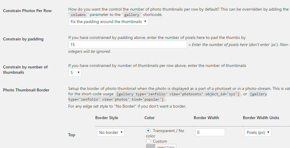
I prefer to constrain by padding, as it adapts better to responsive layouts. You can set very low values for the padding to make the images stack up close to one another.
Circular Thumbnails 🔗
Similar to the square thumbnail grid, the circular thumbnail layout creates a grid of circular thumbnails. This is triggered by setting layout='circle'. In the following example I have shown a set of photos from Google Photos in a grid of circular thumbnails:
[gallery type='google' view='photos' album_id='AKMhXYxmTsxFmsIJOAI3qZ0XM_kHlTf88PMQi0N770n1ZXJQhKyhH8o4qgJMPldgyLjHZuhnHrlh' layout='circle' count=5]Slideshows 🔗
Now we get into the more fun layouts! The first is the slideshow layout, which displays a perfectly responsive slideshow. This layout is triggered by setting one of the following values to the layout attribute (style for native WP galleries):
strip-belowstrip-abovestrip-rightno-strip
While displaying a slideshow, a lot of implicit parameters come into the picture, which can be overridden via the shortcode:
fx– Can take valuesfadeorslide, defaults toslide.speed– Takes numeric values in milliseconds, determines the speed of transitioning of slides.timeout– Takes numeric values in milliseconds, determines the pause between two slides.pause– Takes values0(no pause) and1(pause), determines if the slideshow should pause upon hovering on it.controls– Takes valuesshowandhide, and shows “Previous” and “Next” buttons on the slideshow.columns– Can take positive integer values. If set, it displays the specified number of images in the slideshow’s viewing area, not just a large single image.strip-style– Takes valuesthumbs(the default) andbuttons. If set tobuttons, and if thelayout/styleparameter is set tostrip-below,strip-above,strip-right, it shows buttons below the slideshow, replacing the thumbnails from thethumbssetting. Note that the thumbnails can be displayed below, above or to the right of the slideshow, while the buttons can only be displayed below.
The following uses:
[gallery type='wp' id='1086' style='strip-below' strip-style='button' controls='show']

")


A word about the responsive behaviour of slideshows – when you start resizing the window and the size drops below 800px, the slideshow switches to start displaying 2 columns (unless you started with 1 column), and when you further drop below 480px it switches to start displaying a single column.
Random Justified Grid 🔗
The next layout is the Random Justified Grid. This is triggered by setting layout='random'. It displays photos in a neat, responsive grid of justified images, in a manner such that all images in a row are shown with the same height, and all rows’ edges are aligned to each other.
If you would like your images to be of a certain minimum height and have a specific gap between them, you can control the settings from Photonic → Settings → Generic Options → Layouts → Random Justified Gallery – Minimum Tile height and Photonic → Settings → Generic Options → Layouts → Random Justified Gallery – Padding respectively.
The following is an example of a Random Justified Grid showing a Flickr album:
[gallery type='flickr' user_id='35553131@N07' count=5 view='photos' layout='random']Masonry 🔗
While I started on the Masonry layout using the Masonry script, I quickly came across several limitations that prevented it from behaving correctly when new images were added to a gallery (e.g. via the “Load More” feature). Eventually I gave up, and went the CSS3 route. The downside of using CSS3 is that IE only supports it from IE10 onwards. So for those cases I went ahead and put in a plug to use the Masonry script for IE9 and older versions of IE. There will be some layout issues for people using IE9 to view a masonry gallery with “Load More”, however I figured that this was a significantly small cross-section of people.
The Masonry layout is triggered by layout='masonry'.
The number of columns in the Masonry layout appearance is controlled by two things: the columns parameter of the shortcode, and the setting in Photonic → Settings → Generic Options → Layouts → Masonry Layout – Minimum Column Width.
- Let’s say you specify
columns='2', and your content is 600px wide, while the minimum column width is set to 200. In this case you will be shown 2 columns, each 300px wide (inclusive of padding). Upon shrinking the window the columns will progressively narrow down, until they get to 200px wide, at which point your layout will switch to a single-column layout. - On the other hand, if you specify
columns='auto'and your content is 800px wide with a minimum column width of 250, you will get 3 columns approximately 267px wide. If your content shrinks down to < 750px, you will switch over to 2 columns, and so on.
In other words, the minimum column width dictates how many columns will be shown based on the width of your content.
In the following I have used thumbnails for a WordPress gallery to illustrate the shrinking behaviour. My minimum column width is set to 150px.
[gallery ids='2127,2128,2129,2130,2131,2133,2134,2135,2136,2137,2138,2141,2142,2143,2144,2146,2148,2149,2150,2151' columns='4' main_size='full' tile_size='medium' style='masonry']


Mosaic 🔗
Activated by layout='mosaic', the Mosaic layout is inspired by the JetPack Tiled Gallery layout, but with a few significant differences:
- JetPack relies on images that are local, then computes the sizes in the back-end in PHP and does some sort of a “best fit”. But since Photonic, for the most part, shows images that are not on your server, the computation happens the front-end in JS, after the images are downloaded to the user’s browser.
- As stated above, JetPack computes a “best-fit”, so there are several cases where images show up cropped. That doesn’t happen for Photonic. Photonic’s Mosaic layout gets you perfectly resized images, without any cropping.
- When you resize your window with a JetPack gallery, all thumbnails shrink proportionately, and at one point you might have very tiny tiles. But in Photonic the layout gets recomputed so as to keep your thumbnails from getting too small.
As with the previous two layouts, Photonic lets you control the Mosaic layout by means of the setting, Photonic → Settings → Generic Options → Layouts → Mosaic Layout – Trigger Width. Essentially Photonic will not try to cram too many tiles into a row of the Mosaic layout. The number of images is controlled by the following equation:
Number of images = Math.floor(Width of content / Trigger Width)So, for a wide layout you will get more thumbnails in each row, while for a narrow layout you will get fewer.
The following is a SmugMug album displayed as a Mosaic:
[gallery type='smugmug' view='album' album='zCKf5m' layout='mosaic' password='Saffa' count=5]Photos from within a Group of Albums 🔗
Since Photonic lets you see both albums (or sets or galleries – whatever the provider calls them) and photos on your site, the question that comes up is, how are photos shown from a collection of albums? There are two ways – by directly starting up a lightbox, or by displaying an interim popup panel with the photos, which can then be clicked to see the photos. This can be controlled either by setting Photonic → Settings → Generic Options → Overlaid Popup Panel → Enable Interim Popup for Album Thumbnails (which sets the default), or via shortcode attribute, popup='show' or popup='hide' or popup='page'. Take a look at the following examples.
Example 1 – Directly starting the lightbox
I will use the following shortcode:
[gallery type='smugmug' view='albums' filter='xxgBVG,gPxCw4,zCKf5m' nick_name='sayontan']Note that my option Photonic → Settings → Generic Options → Overlaid Popup Panel → Enable Interim Popup for Album Thumbnails is set to hide the popup (i.e. directly launch the lightbox), so I don’t need the popup='hide' attribute.
Example 2 – With the interim popup panel
I will display the same albums as above, but with the interim popup panel shown:
[gallery type='smugmug' view='albums' filter='xxgBVG,gPxCw4,zCKf5m' nick_name='sayontan' popup='show']Note that on your page this looks identical to the previous example. The difference only kicks in when you click on a thumbnail. Which you pick is your choice. The overlaid panel lets you see all photos in an album (the lightbox can only show the maximum returned in a single call to the service provider), but directly launching the lightbox gives a smoother experience.
To activate the “More” button on the overlaid popup, pass the photo_count and photo_more attributes:
[gallery type='smugmug' view='albums' filter='xxgBVG,gPxCw4,zCKf5m' nick_name='sayontan' popup='show' photo_count=20 photo_more='Show More']If you click on the “China, March 2019” album above you will see a button to load the rest of the album.
Example 3 – Album on a Separate Page
I will display the same albums as above, but with a setting to show their photos on a different page within your site:
[gallery type='smugmug' view='albums' filter='xxgBVG,gPxCw4,zCKf5m' nick_name='sayontan' popup='page']Note that on your page this looks identical to the previous two examples. The difference kicks in when you click on a thumbnail. Which you pick is your choice. The album will now open on a new page. This happens via 2 main settings:
- You have to define which page should be used to display the gallery. For this you can create a new page, and associate that page to the option Photonic → Settings → Generic Options → Photo Template → Dedicated page to use for gallery display. You can even have custom content defined for this page.
- You can pass the
popup='page'option as in the above, or define the global option, Photonic → Settings → Generic Options → Photo Template → Enable separate page to show album photos.
To activate the “More” button on the new page, pass the photo_count and photo_more attributes:
[gallery type='smugmug' view='albums' filter='xxgBVG,gPxCw4,zCKf5m' nick_name='sayontan' popup='page' photo_count=20 photo_more='Show More']If you click on the “China, March 2019” album above you will see a button to load the rest of the album.
Deferred Loading 🔗
If you are displaying multiple galleries on the same page, you are likely to face a lag in the loading of your page due to the multiple external calls happening. To prevent this from happening, you can defer the loading of your gallery by passing a show_gallery attribute. This simply shows a button in place of the gallery when the page loads. Upon clicking the button the gallery is displayed.
[gallery type='google' view='albums' filter='AKMhXYxmTsxFmsIJOAI3qZ0XM_kHlTf88PMQi0N770n1ZXJQhKyhH8o4qgJMPldgyLjHZuhnHrlh,AKMhXYx3r1wLaa9Ue8T15uCMb4NZJaNkUTOSVyjH2VWPo61DWStYMzbC3GpCD51Znkb-eARpSlW7,AKMhXYz2mgbcKBRmGHIi-TursTGERR2xyFLajQe-UWR3o1wQvh2G2ucGTgU3nniXgcmFd5c8FePo' popup='hide' show_gallery='Click to see the gallery']Layout Modes 🔗
See the Layout Modes section on the page on Optimization.
Layout Engines 🔗
See the Layout Engines section on the page on Optimization.
Layout Oddities 🔗
There are certain corner cases that need to be noted:
- It is not possible to show the title below the tile in a Random Justified Grid, or the Mosaic Layout.
- Centering the last row
For both, square and circular thumbnails, you can make the layout centrally justified by adding this custom CSS under Appearance → Customize → Additional CSS:.photonic-standard-layout { justify-content: center; }The reason the above is not a part of the core is because if your last row has fewer images than the others, then they also get centrally justified, and can be misaligned with the rows above. So rather than put in the code, Photonic offers you the choice to handle it at your end!
- If you set a padding of 0 between the tiles in the Mosaic Layout, it can, in some cases, lead to 1px lines between the tiles. This is because of JavaScript rounding issues. To avoid this, it is advisable to keep the padding at a positive integer value, such as 2px.
- Bringing the overlaid panel in front
In some cases the overlaid popup panel, if used, shows up under the theme’s menus / headers / content etc. This typically happens due to various site elements (from your theme or another plugin) defined with a higherz-index. This is really easy to fix by adding this under Appearance → Customize → Additional CSS:.photonicModalOverlay { z-index: 100; }Sometimes the value of
100specified above is not enough, in which case you might want to experiment with higher values such as1000. - Setting borders around images
In version 2.27 I removed some options to set some borders and padding around individual photos. These options were rarely used and added a bunch of CSS code to your site needlessly. In case you need to add borders around individual images, you can do something similar to this in Appearance → Customize → Additional CSS:.photonic-flickr-image img { border: 1px solid #666; padding: 5px; }You can make adjustments to the above based on the type of gallery you are working with.