One thought I have been wrestling with since the past few weeks is a redesign of the options menu in Suffusion. While the options page is ultra-powerful in terms of what it can do, it looks rather overwhelming. I am not a big fan of the long list of options that shows up when I click on a tab in the menu and I would dearly love to make it cleaner. If only I could come up with a better solution!
When the options in Suffusion were a lot fewer (think release 2.0.x) the interface was perfect. But as the power of the theme grew, so did the list of options. And it becomes particularly taxing on the eyes of the administrators who have to change the options. There is something that is stopping me from changing the structure of the options page and that is the fact that it is incredibly easy to code it up the way I have it. I started a handful of tutorials on how to write a theme options page a few months back. In that you can see how absolutely easy it is for me to add new options, given the modular structure of my code. I simply need to figure out the option type, provide some option values for it and bingo! The processing code is very straightforward and it automatically picks the options and formats them as appropriate.
But as is the case very often, what is easy to code is not necessarily easy to look at. I did a good bit of redesigning during Christmas last year and came up with two sets of tabs, a horizontal set of tabs for high-level grouping and a vertical set of tabs within each horizontal tab. This at least made the vertical list look a lot smaller. But as I continue to add options, that page is again threatening to look daunting. So what do I do now?
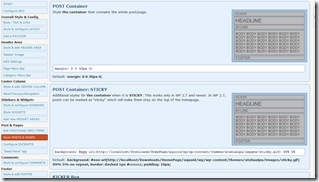
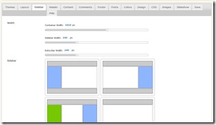
I looked around to see how some other themes do this and here is what I saw in two really good themes:


Suffusion’s options look to a large extent like Atahualpa’s. However, given Atahualpa’s incredible number of options it too probably faces the same fate as Suffusion to a degree. Where it does gain an edge is in the fact that it uses pictures to illustrate what it is talking about and doesn’t rely on text like Suffusion does. I will be the first to admit that Suffusion’s options are verbose.
The other theme presented here is Constructor. If I were to use one word for the options page for Constructor, that word would be lovely. Its options are much fewer in number than Atahualpa’s or Suffusion’s, but the page is truly nice looking. It makes liberal use of JQuery, and is the perfect advertisement for the adage, “A picture is worth a thousand words”. But here is a catch – every option has been manually coded. This is fine with a small set of options, but it will require an effort of Herculean proportions if I were to adopt that approach for Suffusion.
My feeling is that the options page should be something in between the two styles. If I could figure out a way to automate the generation of pages like Constructor’s, that would be perfect. What do you think? How do you feel I can move to a structure more like Constructor’s?
Well, Sayontan, I am not a programmer, but I can list some points which are in my mind for some time:
1) out of historical reasons there is no real separation between “Visual” and “Blog Features” as the Custom CSS-area sits in the “Blog Features” but is expected in the visual section.
Maybe a release jump could split this organisation? :;)
2) it is difficult for an admin to identify which options belong together, when scrolling down. Have a look at the template / magazine-templates, a lot of options are for excerpts, others for categories.
why not group options with “Collapse/Expand” ?
Or give them different colors?
3) a very fast FIRST AID would be to place the “Save”-Buttons on top + at the bottom or as one user suggested to have these buttons scroll with the page
I will download and check Contructor, I don’t know it
Cheers Connie
1) I am checking constructor’s options and I find it very hard to distinguish which themes and layouts are activated.
Activated options need a checkbox or a radiobox-button in any case!
2) As that theme comes without too much explanations it is difficult for first users.You should keep your way of explaining the options
Connie,
Thanks for the suggestions. The thought of creating a further level of division in the options has occurred to me. E.g. If you see the options for “Top Navigation Bar Setup”, I can group the options into “Look & Feel” (things like alignment, navigation bar effects etc. would fit into that) and “Content”, sub-divided into “Pages”, “Categories” and “Links”.
Save buttons on the top are a different prospect, particularly if you want them to stay in place while you scroll through the rest of your page – you will have a second scrollbar, which looks really ugly in a GUI.
Thanks.
Sayontan,
I agree that the options now are becoming confusing and also the amount of scrolling one has to do to go up and down some of the options page IMHO is a bit excessive. I think that it will, however, be a challenge to update the options pages.
A suggestion to help with regard to the forums, where the same question is asked time and again and also to assist new users would be to create a ‘how to use Suffusion’ Wiki. I am sure that several people, myself included, would be willing to contribute to assist in this area. The only challenge for this will be the speed at which you add new functionality which could make some of this content redundant before it is even written.
It may be sacrilege to suggest a may be a slow down in development OR a simple theme like V2.x and a fully featured theme like 3.x? Or for a real challenge how about a novice and an expert options pages?
Colin,
I did start setting up a Wiki and I will be happy to add folks on to it. It is on Google, so if you are interested send me a PM through the support forum.
Also, splitting it into a simple theme vs a fully loaded one was my first idea. Version 1 of Suffusion was a very plain release. It had no options!! So when I released Version 2 with a different name, the WP reviewer rejected it saying that the layout looked very similar to my first version and so I shouldn’t create a new theme for it.
I will think about categorizing options as Beginners / Intermediate / Advanced, though technically there is nothing Advanced yet.
Sayontan.
The idea of different levels seems not handy to me, too.
1) everybody claims himself advanced, who will start with the “simple” version?
2) the users of the “simple” version will cry for options which are normal part of the “advanced edition”
3) as more and more untrained users come to the forum, we need better and more tutorials for the users, a wiki or an enhanced “Howto-Section”
I notice that most users seem to come to the forum directly so they do not notice that there are other informations at hand as well, the tutorials here on that page are not in the focus of the forum users
so, a wiki would be good, but
the wiki, the main site of aquoaid.com and by this the tutorials should be integrated somehow.
I’m very new to WordPress but I find Suffusion intuitive and easy to use. Yes, all those options look overwhelming at first, but when I viewed my site after installing Suffusion I was quite happy with how it looked in the interim. I’m very slowly working through the options and picking up ideas from the other Suffusion users who have been mentioned in the blog and forum. What I would find useful is a few screenshots or diagrams illustrating what section of the screen is referred to, or even a hyperlink to a showcase site that shows some of the terminology used on the area it refers to and illustrates what the latest release covers.
Oh, and thank you for creating this amazing theme.
I agree with Elle. I’ve ever been used atahualpa, I think Suffusion more understanding-theme, even it is not easy at first.
I hope you can make Suffusion’s admin theme follow wordpress admin theme wrapper because it hard for me when using my 10″ netbook..
Personally I don’t care much if the buttons/menu is on the top or at the left. I grew used to your options menu on the left but since WP already has their menu on the left it would certainly make sense to have yours all on the top, for screen real estate…
What I think is more important that that is simply how you categorize all the options. I don’t know how you are doing your backend coding and I didn’t read your theme tutorials you mention, however it seems you are just doing a series of hide/show collapse/expand type of changes in order to display or not all the options.
I believe that if you wanted to re-design it you could simply re-group all the options so that they are more easily identified and accessible.
I also second your words for the use of pictures. Having a preview of what the option does would really be helpful in knowing if you are looking at the right thing. And if you see right away what that option is you can then read less of the verbose description and look for whatever it is your are looking for…
In order not to have too many pictures, which would make it heavier and even more big on the screen, you could just have the title of the option and then some onMouseOver (hovering) type links that display a preview and/or the description.
I think you could do all of this without recoding the entire backend.
And any chance for end user to use as much as options and great themes! 🙂 thank in advanced!
As a first time user I was daunted at first (but now fully appreciate – thank you, thank you) the exhaustive options you have made available on your theme. This is why I chose it in the first place, and plan to use again and again in the future. However, sometimes I just couldn’t figure out what was meant by the various option names and had to do a certain amount of trial and error, checking and changing things until I found what I was trying to modify. I did a lot of Google searches (which helped on some things) and used the search box within Appearance – Suffusion options – as well. The only thing that I could see improvement on would be to provide a picture of an example web page with arrows and labels at the beginning of each page/list for all the modifiable options on that page – sort of like a map. This would be a tremendous help – thanks for such a great theme!