Update: With release 3.7.5, the path to the options is Suffusion Options → Back-end Settings → Custom Includes.
Update: With release 3.4.2, the option group below is no longer called “Custom CSS, JavaScript & RSS”, but it is called “Custom Includes”
I decided to take a pause from my breakneck development and highlight one of the best, and most understated features of Suffusion – Custom Styles. The inspiration for this article is one of the most frequently asked questions that I get:
When I clicked on “Upgrade” I got a message saying that all my changes will be overwritten if I upgrade. Is this true? I don’t want to lose hours of work that I put in to customize my site.
The answer to this question really lies in qualifying “hours of work”. If you have spent the hours modifying the CSS and PHP files in Suffusion, then you are out of luck. You will indeed lose hours, which is a shame because all your CSS changes are absolutely unnecessary.
Seasoned users of Suffusion are probably aware that you can customize your installation of Suffusion almost as you please and not lose any settings when you upgrade. This post is directed towards users who aren’t sure about how to do this. The concept is really, blindingly simple. But before that you need a couple of tools:
- A nice standards-compliant browser, preferably Firefox or Chrome. Though there are other standards-compliant browsers, I would recommend these because of the wealth of extensions.
- At least one of these Firefox extensions, if you are using Firefox: Firebug or Web Developer. Both tools are awesome, though I have a slight preference for Firebug because it seems more concise. If you are using Chrome, you are good to go because Chrome offers an inbuilt feature called “Inspect Element”, which you can see upon doing a right-click on any page element. For people with difficulties switching to the better browsers and still stuck with IE, IE has an extension called DebugBar.
You also need to have rudimentary CSS knowledge, which in the days of Internet excesses, can be readily obtained at W3 Schools. And for some serious CSS stuff, there is a set of CSS tutorials at 456 Berea Street that is just phenomenal. Armed with the tools and knowledge, here is what you need to know:
You don’t need to edit ANY CSS file to change the look and feel in Suffusion.
Yup. Instead, do this. Navigate to Suffusion Theme Options –> Blog Features –> Custom CSS, JavaScript & RSS.
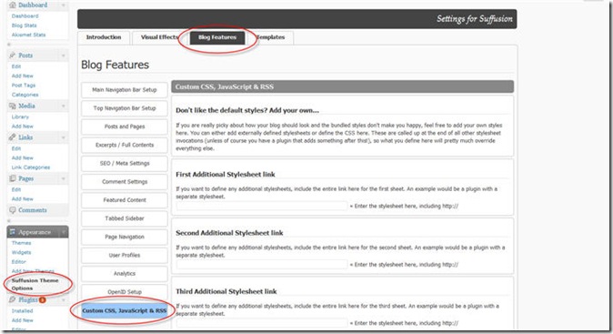
There you will see an option called “Custom Styles”.
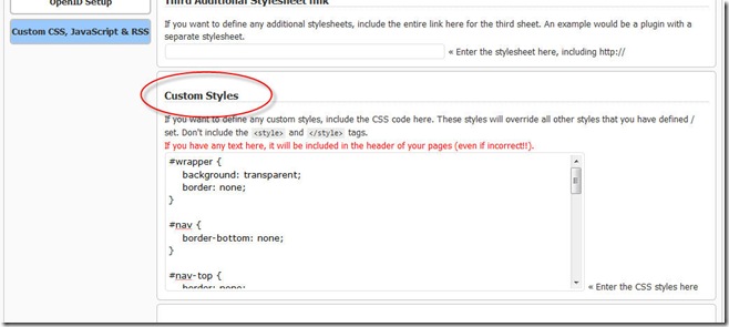
That is where you can put in all your CSS tweaks. This block is called last when Suffusion is being loaded, so if you want to override any of the theme’s styles your best bet is to put in the styles here. Of course, you might have a plugin that does its own fancy things and overwrites Suffusion’s styles, and if that is the case then you will need to badger the plugin’s author for information about changing a style definition. But for everything else, this little option will suffice.
Let me walk you through this with a little example. To start with, I have enabled the “Top Navigation Bar” on this page. Here is how it looks by default:

This doesn’t go very well with the overall transparent look of this site, so I will make the background of the top navigation bar transparent. Without editing any of my theme’s stylesheets. First I will make use of Firebug. Installing Firebug adds an item to the context menu – “Inspect Element”. So I can right click on the navigation bar and inspect it:
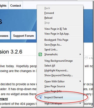 Here is what Firebug shows me:

So the element is called “#nav-top”. Now I do some CSS magic in the Custom Styles:
#nav-top {
        background: transparent;
        border: none;
}
This makes the background transparent and removes the border:
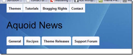
Much better, but I want some rounded corners for the first and last items. But what do I need to modify? Again, Firebug comes to the rescue. I right-click on “Themes” and inspect the element:
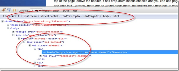
OK, so inside #nav-top there is a div with class “col-control”, inside which there is an unordered list (ul) with class “sf-menu”, which obviously has a list item (li) with the links to the pages in the menu. This is a lot of information, but luckily we don’t need to know so much. The good thing about CSS is that the rules and structures are cascading, so I don’t need to call the interim levels if I can avoid it. This is what I add to my custom styles:
#nav-top ul.sf-menu li,
#nav-top ul.sf-menu li > a,
#nav-top ul.sf-menu li > a:hover {
        border-bottom-left-radius: 5px;
        -moz-border-radius-bottomleft: 5px;
        -webkit-border-bottom-left-radius: 5px;
        -khtml-border-bottom-left-radius: 5px;
}

#nav-top ul.sf-menu li,
#nav-top ul.sf-menu li > a,
#nav-top ul.sf-menu li > a:hover {
        border-bottom-right-radius: 5px;
        -moz-border-radius-bottomright: 5px;
        -webkit-border-bottom-right-radius: 5px;
        -khtml-border-bottom-right-radius: 5px;
}
This works, but a bit too well, unfortunately, rounding off all the corners:
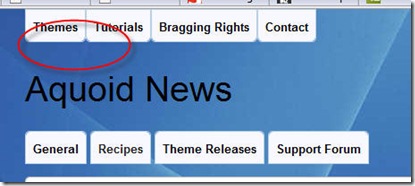 Here the articles from Berea Street come really handy. All I need to do is define the bottom left corner for the first list element and the bottom right corner for the last CSS element:
#nav-top ul.sf-menu li:first-child,
#nav-top ul.sf-menu li:first-child > a,
#nav-top ul.sf-menu li:first-child > a:hover {
        border-bottom-left-radius: 5px;
        -moz-border-radius-bottomleft: 5px;
        -webkit-border-bottom-left-radius: 5px;
        -khtml-border-bottom-left-radius: 5px;
}

#nav-top ul.sf-menu li:last-child,
#nav-top ul.sf-menu li:last-child > a,
#nav-top ul.sf-menu li:last-child > a:hover {
        border-bottom-right-radius: 5px;
        -moz-border-radius-bottomright: 5px;
        -webkit-border-bottom-right-radius: 5px;
        -khtml-border-bottom-right-radius: 5px;
}
This looks much better, excerpt for one minor quirk – the first elements in all lists have rounded corners:
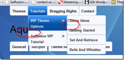 So we need to tell the code to only pick the first and last children of the top level list. Again, this is done easily using the “>” selector in CSS (refer the Berea Street link above):
#nav-top ul.sf-menu > li:first-child,
#nav-top ul.sf-menu > li:first-child > a,
#nav-top ul.sf-menu > li:first-child > a:hover {
        border-bottom-left-radius: 5px;
        -moz-border-radius-bottomleft: 5px;
        -webkit-border-bottom-left-radius: 5px;
        -khtml-border-bottom-left-radius: 5px;
}

#nav-top ul.sf-menu > li:last-child,
#nav-top ul.sf-menu > li:last-child > a,
#nav-top ul.sf-menu > li:last-child > a:hover {
        border-bottom-right-radius: 5px;
        -moz-border-radius-bottomright: 5px;
        -webkit-border-bottom-right-radius: 5px;
        -khtml-border-bottom-right-radius: 5px;
}
In the above we are telling the code to only apply the rules to the immediate children of the top level list, not nested children. The result is indeed pleasing:
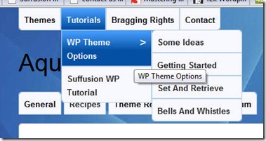
No unwanted rounded corners are seen above. Now let’s say we want to add some finishing touches by increasing the space between the top level items. Again, using Firebug and basic CSS:
#nav-top ul.sf-menu > li {
        margin-right: 5px;
}
That completes the exercise and I now have the look I set out to achieve:
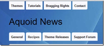
The good thing is that all my changes are stored in the database and not as files. So even if I upgrade my theme I am covered.
One of Suffusion’s active contributors in the support forum, Connie put together a very descriptive article on the same topic, but using Web Developer as the extension.
You are so right! That is one of the main reasons why I choose that theme and it is just straight out GREAT!!!! 🙂
Sayontan…
What a superb tutorial!
Thank you!
Best, Peter
PS: Would be great if you did a similar one about the Magazine options… the range is so vast, it’s hard to figure it out
Thank you very much. You gave me enough guidance to fix two nagging issues on my blog.
The Suffusion theme rocks!
Just wanted to mention that your last bit of extra code “#nav-top ul.sf-menu > li” doesn’t work. I don’t know if it did at one time but now you need to leave out the “>” in the line for it to work…
Awesome tutorial though! Maybe that’s where this entry should be? It really helps people understand how your theme works and some of it’s advantages. Also, I’ve not used Firebug before. What a great tool!! Thanks for everything Sayontan!!
Actually, now that I look at this post more deeply, it seems like there’s a bunch of “>” in the code that I don’t see there in this theme anymore. Maybe this post needs an update of sorts?
Thanks. The “>” is very much in use, though, on this very page. You can look at the source code for this page to see how. The spacing between the “Announcements”, “Themes” and “Tutorials” is governed by this code indeed. If you are using Firebug, select one of the “li” tags instead of the “a” tags – you will see the usage.
In fact, the entire code in this tutorial is used for the setup of this site.
I’d like to add a background to the Top Navigation Bar. How could I do that?
Please use the support forum for queries.
WOW! I just gotta say the Suffusion Theme destroys anything else out there! Thesis? pffft… toss that in the garbage Suffusion crushes it!
Forget a cup of coffee my friend, I’m sending the Maxwell truck to your office!
Keep up the great work!
Thanks! Waiting for that truck …
[…] That’s all. This is best suited if you are using the child theme as a replacement for the Custom Styles option.BuddyPress tagThis is a very simple trick for using Suffusion with the Suffusion BuddyPress Pack. I […]
Cool! Really easy to find the item I wanted to change — I put in:
.entry {
border: none;
}
And voila! Thank you!!
I’m an idiot and edited the CSS- how to I just put the original back- I just tweaked the header stuff a little and see now I did it wrong- (should be using the custom css…)
thanks!
Megan
ha ha, i figured it out, so you can ignore this (duh, I had the zipped file)
Loved the title 🙂
Good article to start with for css changes 🙂
[…] For brief tutorial, go here: https://aquoid.com/news/2010/02/there-are-some-things-suffusion-cant-do-for-everything-else-there… […]
[…] The third method is even simpler. You can leave your Blog Features → Child Themes to inherit the stylesheets. But simply don’t put any @import statements in your style.css. That’s all. This is best suited if you are using the child theme as a replacement for the Custom Styles option. […]
thanks for the info – i have always suffusion as i think it’s the best out there!
I should have place the coding above in Custom Includes but i edited some php file in the editor and dont remember which.
can anyone tell me which php file it should be?
thanks
joseph
I am fairly new to WP and themes but I’ve gotta admit I’m loving Suffusion so far, I think I made the right decision in going with it.
A small question if I may, can you explain the benefits / differences with using custom css as opposed to a child theme?
If your only desire is to change look and feel aspects of the theme, the Custom CSS is fine. If you want to do PHP edits / BuddyPress or e-Commerce support / multilingual sites, then use a child theme.
Thanks Sayontan, you are an I.T God! haha, I have quite a few things I’d like to implement and I’ve been researching Custom CSS vs Child Themes, as it is I think I need a child theme…however having read through your release notes for v4.0 I think you have covered almost everything I need in there! Can you give us a clue as to when it will be available??
I am working towards finishing it. It is a lot of work.
Sayontan,
Can you please tell me how to set a fixed width for every menu Item in the navigation bar(Top Bar)?
[…] Answer Two: Read the following URL There Are Some Things Suffusion Can’t Do. For Everything Else There Is The Custom Styles Optio… […]